September 22, 2026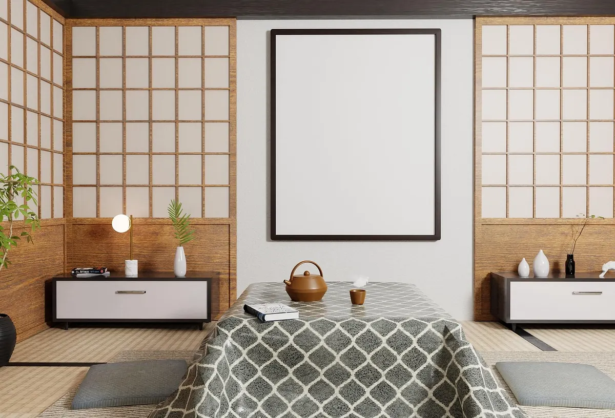
You have finally bought the piece. A hand-built ceramic dish with a speckled glaze, a linocut pulled by a maker you have followed for years, a woven hanging that took somebody a fortnight. It arrives, you unwrap it, you love it — and then it sits propped against the skirting board for three weeks because you cannot commit to a spot on the wall.
That hesitation is sensible. Handmade work is often one of a kind, awkward in standard sizes, and chosen slowly. But gallery walls that end up looking wrong rarely fail because of the art itself. They fail because of the arrangement: the gaps, the heights, the frames, the light. Here are the mistakes worth sidestepping.
Getting the scale wrong
The most common problem is art that is too small for its wall. A single 20 x 25cm print floating alone on a three-metre expanse looks like a postage stamp on a billboard, no matter how beautiful the print is. You have three ways out: group several small pieces so they read as one shape, add a large anchor piece to hold the arrangement together, or give a small piece a wide mount and a generous frame so it occupies more wall without pretending to be bigger than it is.
The opposite mistake is just as easy to make. A piece that is nearly as wide as the wall leaves nowhere for the eye to rest, and it can make a room feel cramped rather than generous. As a rough guide, art hung above a sofa or sideboard usually looks balanced when it spans somewhere between two-thirds and three-quarters of the furniture's width. Not a rule — a starting point.
Spacing that fights itself
Once you have two or more pieces, the gaps matter more than the frames. Too wide and the arrangement breaks into separate islands, each competing for attention. Too tight and it feels crammed, particularly with handmade frames, which often have uneven edges, visible joins or a chunkier profile than shop-bought mouldings.
A gap of roughly 5–7cm between frames keeps a group reading as one composition, and a slightly tighter 4cm works well for a neat grid of same-sized pieces. What matters most is consistency. Measure the gap rather than eyeballing it, and measure between the frames themselves, not between the outer edges of any mounts — uneven mount widths are a common cause of arrangements that look lopsided even when every frame is perfectly level.
Hanging at the wrong height
Many people hang art too high, out of a vague instinct that it should sit near the ceiling line. A useful starting point is to put the centre of the arrangement at roughly 145–150cm from the floor, which is about eye level for most adults. Then adjust for the room.
Above furniture, the bottom edge of the frame should normally clear the top of the sofa back, sideboard or bedhead by 15–25cm. Any less and the art looks squashed against the furniture; much more and it drifts free of it, floating in the middle of the wall with no relationship to anything. In a hallway, where people are standing and moving rather than sitting, a touch higher is fine. Stairwells are their own puzzle: follow the line of the handrail or the stringer if you want the arrangement to feel deliberate rather than accidental.
Frames and mounts that compete with the work
Handmade pieces already carry a lot of texture and colour. An ornate gilt frame around a busy woven textile, hung on patterned wallpaper, gives the eye nowhere to settle. Mixing frame styles is perfectly good — a wall of identical frames can look like a shop display — but the mix needs a thread running through it, whether that is a repeated finish, a consistent frame width, or a palette drawn from the artwork itself.
Two practical points worth knowing. First, give textiles, prints and delicate paper a mount or a spacer so the work is not pressed directly against glass, and consider a deeper frame box for dimensional pieces such as ceramics, plaster casts or stitched work. Second, do not be tempted to trim a handmade piece to fit a cheap readymade frame. A framer can build a mount to the size you have, and the piece will hold its value and its proportions.
Lighting that flattens texture or throws glare
This is the mistake people notice last and regret most. A handmade piece is usually chosen for its surface — the ridges in a woven hanging, the glaze pooling on a bowl, the grain of the paper — and flat, ceiling-only lighting erases all of it. Angle a picture light or a small wall light down at roughly 30 to 45 degrees from above the frame, so the light grazes the surface instead of hitting it head-on. Warm white bulbs flatter most work better than cool ones.
Glare is the other half of the problem. If you can see a window reflected in the glass from your usual chair, so can everyone else. Move the piece, angle the light, or accept a different wall. And keep textiles, watercolours and anything dyed by hand out of direct, hard sunlight, which will fade them over the years far faster than you expect.
Planning on the wall instead of on paper
Holes are permanent. Fortunately, the planning is not.
- Cut paper templates for each frame and mark the hanging point on each one — the apex of the wire or the top of the D-ring, not the top of the frame.
- Tape the templates to the wall with low-tack painter's tape, positioned with your measured gaps and centre line.
- Step back and take a photograph. Seeing it on a screen flattens the arrangement and makes imbalance obvious.
- Leave it there for a day. Anything that nags at you on Tuesday evening will still nag at you in a year.
- Check for cables and pipes with a detector, use the right fixings for plasterboard or masonry, and hang the heaviest piece first so you are not drilling near something already in place.
One more thing: not every handmade piece has to be a filler in a gap. A small ceramic tile or a single embroidered hoop can stand alone in a narrow space — beside a doorway, above a desk, in a corner where nothing else fits — and it will look more considered than a cluster of odds and ends pressed together purely to fill wall space.
A last look before the drill comes out
Once the templates are up, run through this quickly:
- Gaps even, and roughly 5–7cm across the group.
- Centre line about 145–150cm from the floor.
- Bottom edge 15–25cm above the sofa or sideboard.
- Nothing crowded against a door frame, light switch or radiator.
- Frames level — checked with a spirit level, not your eye.
- No glare from your usual seat, and no direct sun on textiles.
- Weight of the heaviest piece matched to the fixing in the wall.
Arrangements are not permanent. As your collection grows, or a piece sells to someone else, you will shuffle things around, and that is part of the pleasure of buying work made by hand rather than in a factory. Live with it for a season, then look again with fresh eyes. If a wall still feels slightly off, the fix is almost always one of the seven above — spacing, height, scale or light — rather than the piece itself.
Photo: Mediamodifier / Pixabay